
Course: Programmed Design
Goal
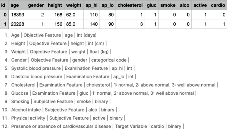
The main task of the course was to design and implement an interactive data visualization which should contain as little text as possible. A website programmed using HTML, CSS and Javascript had to be created, consisting of at least three different representations of the data set, which were interactively linked with each other. First of all, a suitable data set had to be found. This should offer enough parameters and associated data so that an interesting graphic is created in the end. I found a suitable dataset on cardiovascular disease. It had twelve parameters (age, weight, blood pressure, cholesterol level, alcohol consumption, etc.) with data on over 70,000 people from which it was possible to draw interesting conclusions.
Concept
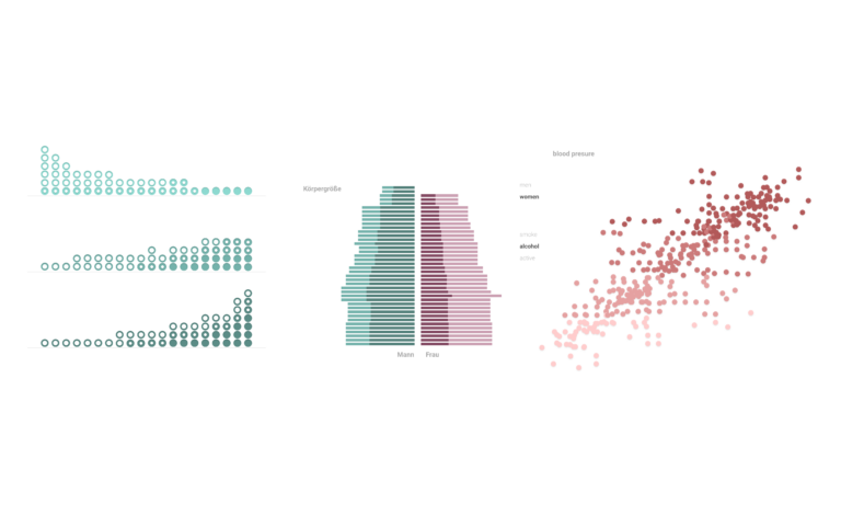
Since we were to end up with three representations, I had to extract the most exciting correlations from the data set. I decided to show the correlation between weight, cholesterol and blood pressure on the first chart. For the second plot, I decided to show the correlation between gender, height and blood pressure to find out whether height and gender also have an influence on blood pressure and cardiovascular diseases. In the last interactive presentation, I wanted to show the influence of alcohol, cigarettes and age on a disease and to show how many people are actually affected. Once I had decided what I would like to show, I made sketches of possible ways of displaying it. Since as little text as possible should be used, the idea was to be able to call up information later by hovering over the graphics.
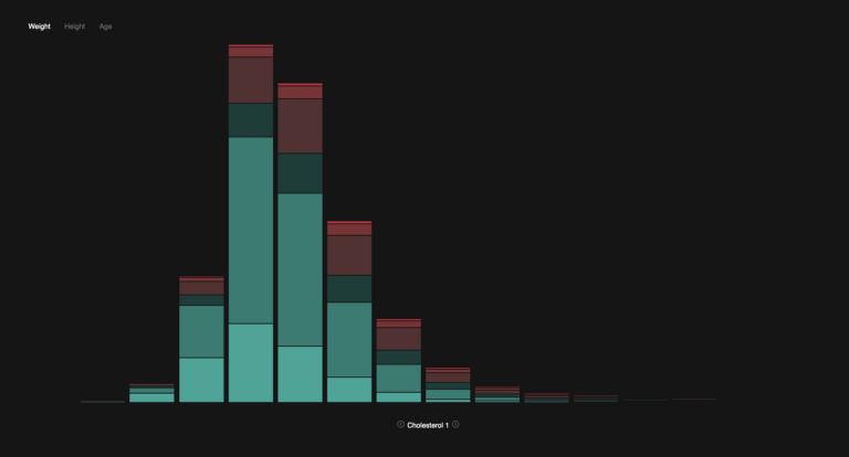
Cholesterol, weight, blood pressure
When you enter the interactive application, you find yourself on the screen with the connection between cholesterol value, weight and blood pressure. Initially, only people with a normal cholesterol level are shown. The x-axis divides the persons into weight classes (10kg steps each), the y-axis shows the number of persons and the colour shows the blood pressure value (the further into the dark red, the higher). If you now change the cholesterol value in the lower area with the arrow keys to „above average“ or „strongly above average“, you will notice that the red areas of the graph increase and the green areas decrease. This means that higher cholesterol values lead to higher blood pressure and increase the risk of cardiovascular disease.
Gender, height, blood pressure
The second plot, which can be selected in the tab above, shows the correlation between gender, height and blood pressure, as already mentioned. The left half of the diagram shows men, the right half women. The y-axis shows the height of the persons in centimetre steps. The blood pressure value is expressed by the colour, similar to the first representation.

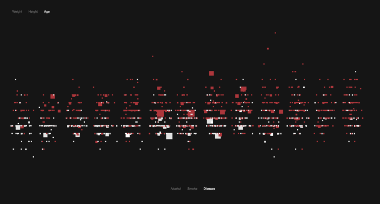
Age, blood pressure, cardiovascular disease
In the last diagram, which can be accessed via the tab at the top, you can see the correlation between age, blood pressure value and an actual cardiovascular disease. Age is reflected on the x-axis and blood pressure on the y-axis. In the lower part of the display, you can select which persons are to be shown. The persons are then coloured red accordingly. It is possible to select between persons who smoke, drink alcohol and actually have a cardiovascular disease and thus determine the correlations. People with exactly the same values are grouped together, which is why some boxes are larger than others.