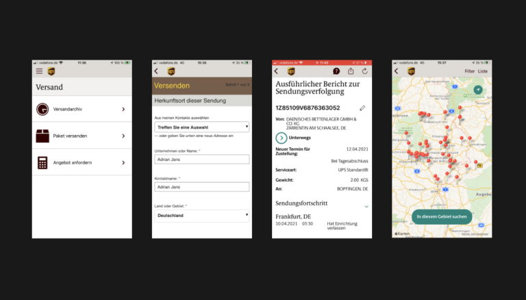
The existing UPS app is described by users in the Apple AppStore and GooglePlay Store as clunky, user-unfriendly, confusing and oversized. Interaction mappings of the user tests we conducted clearly showed where the weak points of the app were located and where usability and user experience had significant weaknesses. We would like to eliminate these weaknesses and offer users an app with which they can complete their tasks quickly, easily and reliably. The existing corporate design of UPS is to be taken up and modernised.
Concept
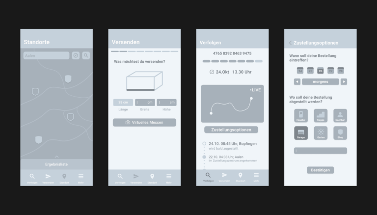
The advantages and disadvantages of existing parcel delivery apps should be determined in a competitor analysis with user tests and then analysed in the context of the needs of corresponding protopersonas. Once the advantages and disadvantages of the existing apps were clear, we began to develop the concept. With „How Might We Questions“, which addressed problems, we looked for solutions in the first sketches and created variants. Subsequently, the final variants were implemented as a minimal viable product consisting of wireframes, which were then tested.
Realisation
After checking the concept through final user tests, it was implemented in Figma with final changes. Design principles should form a starting point for the following visual design: Fast: The app should bring users to their goal as quickly as possible with self-explanatory functions. Uncomplicated: The app should bring the user to his or her goal in a simple and uncomplicated way with clear functions and offer a modern environment. Supportive: The app should be based on easy-to-understand functions and pave an easy way for users to reach their goals with small notes and assistance.
Visual Design
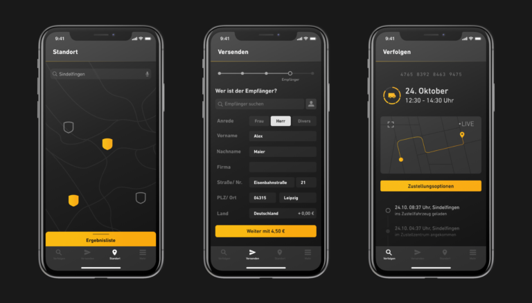
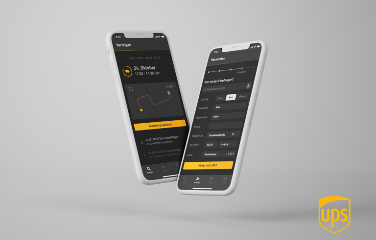
The Dark UI is a central part of the visual design. On the one hand, we wanted to take on the task of designing a more sophisticated Dark UI, but on the other hand, the main reason was that we wanted to adopt the look & feel of UPS from our mood board. The visual design was to build on UPS’s existing corporate identity and bring it into the 21st century. This is supported by modern and contemporary typography, and generally by a clear and consistent design language. After designing the screens in Figma, they were prototyped with Protopie.